


.png)
.png)
.png)
.png)
.png)
.png)
What is cycle time?
Cycle time refers to the time elapsed between the moment a task is started, and its conclusion. It is a measure of how long it takes from when work starts on an item (story, task, bug, etc.) until it is delivered. Cycle time indicates how long (in calendar time) it takes to complete a task.
The cycle time in Jira's default board would be the time it takes to complete a story or task and take it from “In Progress” to “Done”.
Why is cycle time better than velocity for measuring a team's predictability?
Predictability is an important goal of any Agile team that aims to serve business needs. It is impossible to coordinate a product launch or reach quarterly goals without knowing how long the work is going to take. Agile traditionally measures predictability based on the velocity of the work.
According to Scrum, Inc., team velocity is a “measure of the amount of work a team can tackle during a single sprint and is the key metric in Scrum.”
Velocity depends on story point estimates made before work starts, using an educated guess of how much work is needed, regardless of the "Cone of Uncertainty”. Knowing this, can we still compare one sprint velocity to the previous one? Velocity can go up and down for numerous reasons, from the fact we got better at estimating, got a new task that we never really completed, or onboarded a new team member.
Cycle time is learning from the past. This removes the hopes and wishes and reveals the hard truth of how long it takes to complete an average story. We can quantify and understand the speed at which an engineering team can deliver working software. When we combine cycle time data with throughput, the size of your backlog, and an understanding of how often new work interrupts your roadmap, teams can use cycle time to more accurately predict when work will be completed. Cycle time measures what happens in the real world, not just our expectations of what will happen under ideal conditions. Improving cycle time will boost your engineering team’s efficiency: you’ll deliver value to your users more quickly, shortening the developer/user feedback loop and boosting the efficiency of our team.
The most significant difference between the two metrics is that velocity reflects how much gets done, while cycle time reflects how long it takes.
One might think that both metrics will generate the same figures. However, as not all tasks start and end during the same Sprint, we might find our velocity chopped by the Sprint’s duration. Moreover, we ought to remember that story points are a proxy to the story’s complexity, and don’t take team delays into account. As cycle time does account for the delays, it doesn’t matter how complex the stories are; the average cycle time can be a better predictor of whether a task has a chance of ending during a given iteration.
Why JIRA’s out-of-the-box solutions fail
Despite cycle time's growing popularity, JIRA does not offer Agile practitioners an effective way to measure cycle time. JIRA offers two ways for users to obtain this information: time in column indicators, and control charts.
Days in column indicators
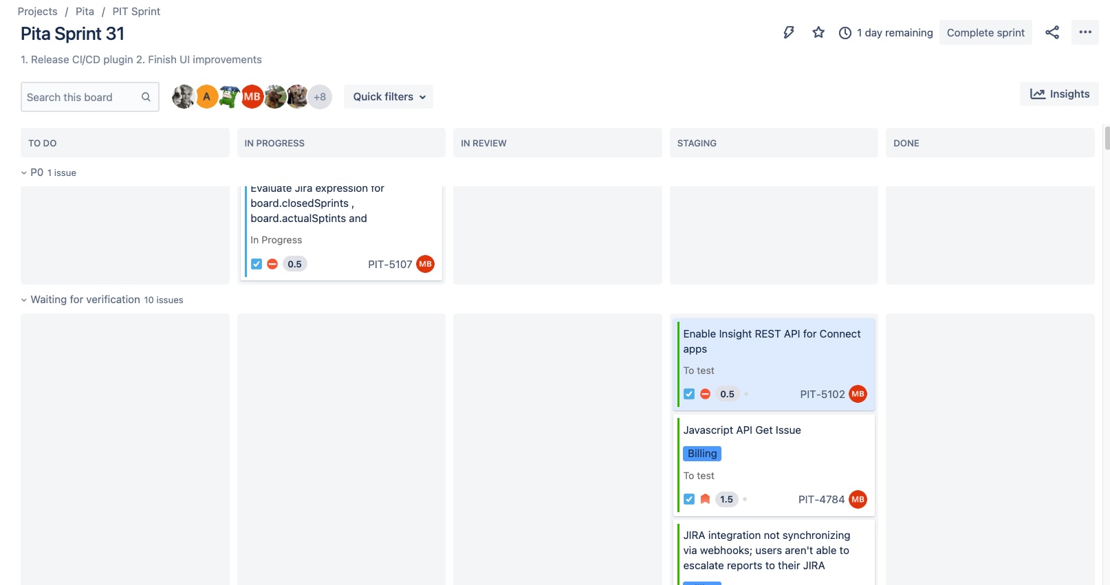
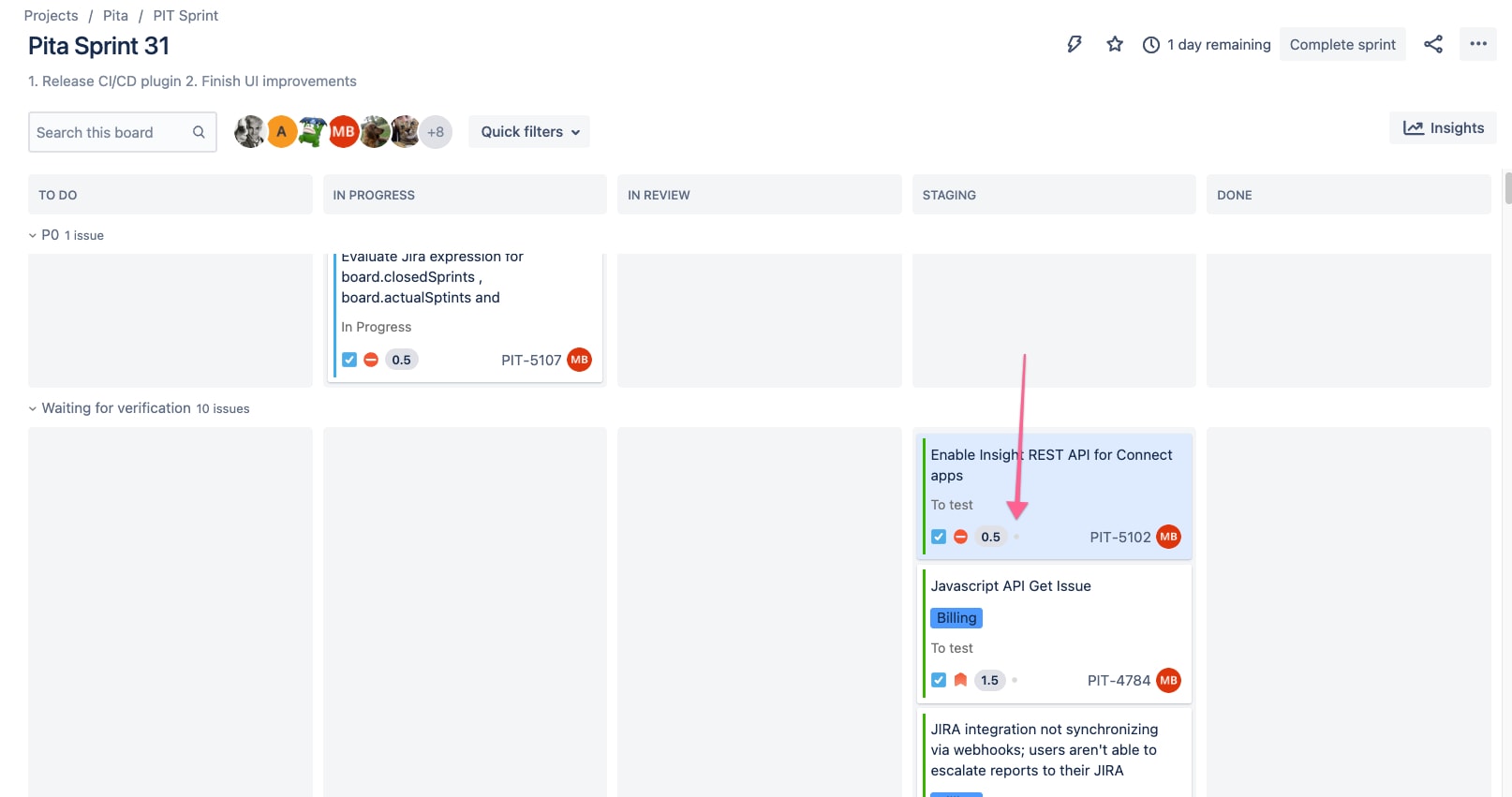
Time in column indicators are enabled for JIRA boards by going to Board Settings > Card Layout.

JIRA’s user interface displays 3 dots (two gray and one yellow) for an issue that has been hanging out in QA for 4 days (I agree, that's too long, but it's a Monday and our QA is out – give us a little slack). These dots are not aggregated in any way to give a sense of the team's progress in keeping tickets flowing. Without a dedicated report, visual indicators are just vanity metrics to identify individual problems.
Control chart
That brings us to the Control Chart, JIRA’s way of measuring a team’s cycle time.
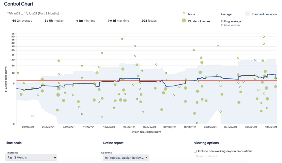
It takes the time spent by each issue in a particular status (or statuses), and maps it over a specified period of time. The average, rolling average, and standard deviation for this data are shown.
According to the documentation, the rolling average (blue line) is issue-based, not time-based.
The rolling average is calculated for every issue on the chart (at that time) by taking the issue itself, X issues before the issue and X issues after the issue, then averaging their cycle times. 20% of the total issues displayed (always an odd number and a minimum of 5 issues) are used for the calculation.
The problem is that the rolling average of X issues before and after renders the metric pretty much worthless. We can’t understand the effect of each member and or retrieve any actionable information from it. In addition, rolling average calculation also means that changing the time frame of your report will dramatically impact the results. While the control chart does a good job of visualizing outliers to spark conversation, using it to actually track and reduce cycle time is a frustrating task, at best.
The Solution and its limitations
You can get a much more useful cycle time metric for your team with a few minutes of setup and minimal effort for each iteration – Just a bit of JIRA and pivot table magic will do it. Below are the steps you need to take in order to get JIRA to calculate the cycle for you. However, as you will read later, this solution has a major caveat that you should be aware of.
How to create a useful cycle time metric
Step 1: Create a custom field
Follow the Atlassian Support Documentation to create a new “Cycle Time Start Date” field and add it to the field configuration for any relevant issue types you want to track. For my team, we added the new date field to Story, Bug, and Task, to all screens.
Step 2: Create a post-action on the relevant workflow transition
Workflow post function in JIRA executes additional actions after a workflow step is completed.
This is perfect for marking the date on which an issue transitions to “In Progress” (or whatever status makes sense for your team) so you can start measuring cycle time.
You can find more information about setting them up in the support documentation here. As you can see in the screenshot below, our workflow step is configured to automatically set the new custom field to the current date and time.
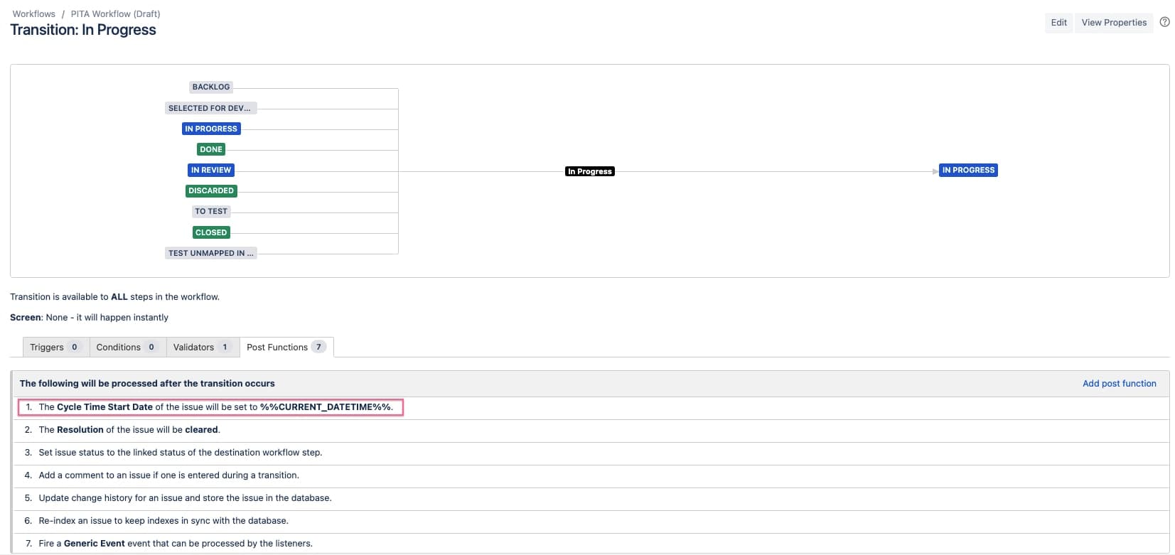
⚠️ Be aware – The example above has a flaw that may or may not affect how you want to measure cycle time for your team. The post function will run every time an issue is moved to “In Progress,” overriding any previous values if the issue is returned to “In Progress.” This may happen if your workflow permits such transitions. You can prevent this by updating your workflow so it doesn’t reuse this transition and only set the post function on the appropriate transitions.
Step 3: Wait and export a report from bulk issue search
After you publish your workflow changes you will need to wait a few days/weeks for the data to be populated.
The next step is to export all issues that have been completed in the last X days of your project. You should save this query as a filter in order to ensure consistency. Next, set the columns to show the issue key, type, cycle time start date, resolution date, assignee and anything else you may wish to report on.
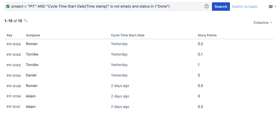
Export your search results as a CSV file and import them into your spreadsheet application of choice.
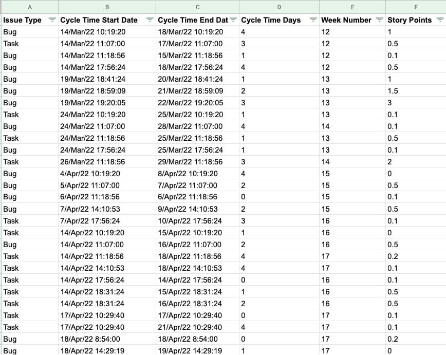
Step 4: Set up your pivot tables and charts
Import the raw CSV to a new spreadsheet. Then add two new helper columns: “Cycle Time Days” and “Week Number.”
- Cycle Time Days – The number of days Cycle Time Start Date and Resolution Date. In Google Sheets, use the formula “= days(Resolution date, Cycle Time Start date).”
- Week Number - View the progress week-by-week. In Google sheets, use the formula “=weekNum(Resolution date).
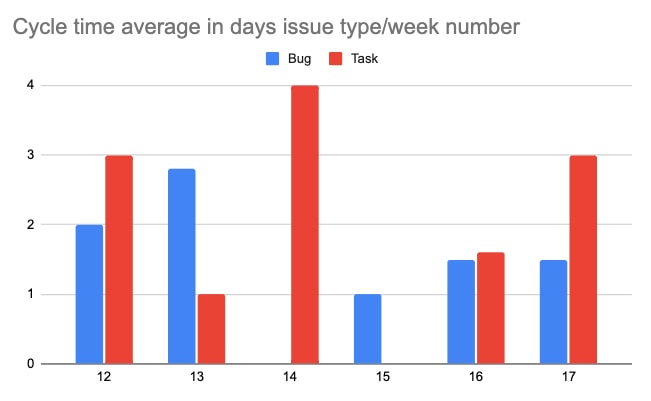
Next, set up a pivot table with "Week Number" as rows, issue type as the columns, and the average cycle time days as the values.
Once you have the pivot table set up, you can create the “cycle time average in days issue type/week number chart” easily:
Nice, but where is my history?
So that’s a big limitation with this method. As we rely on the post workflow transition function, we can only extract data from the moment we publish the workflow.
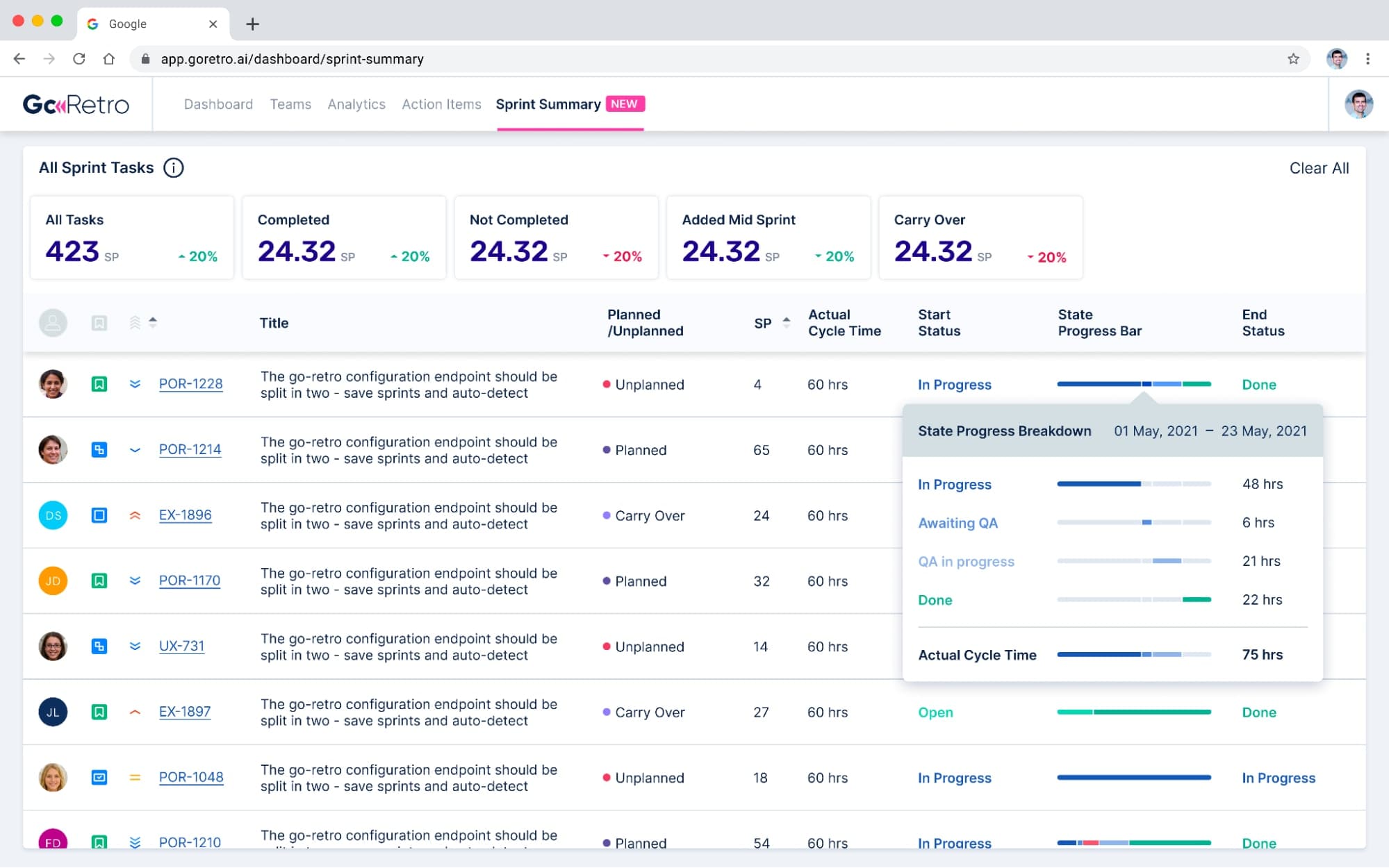
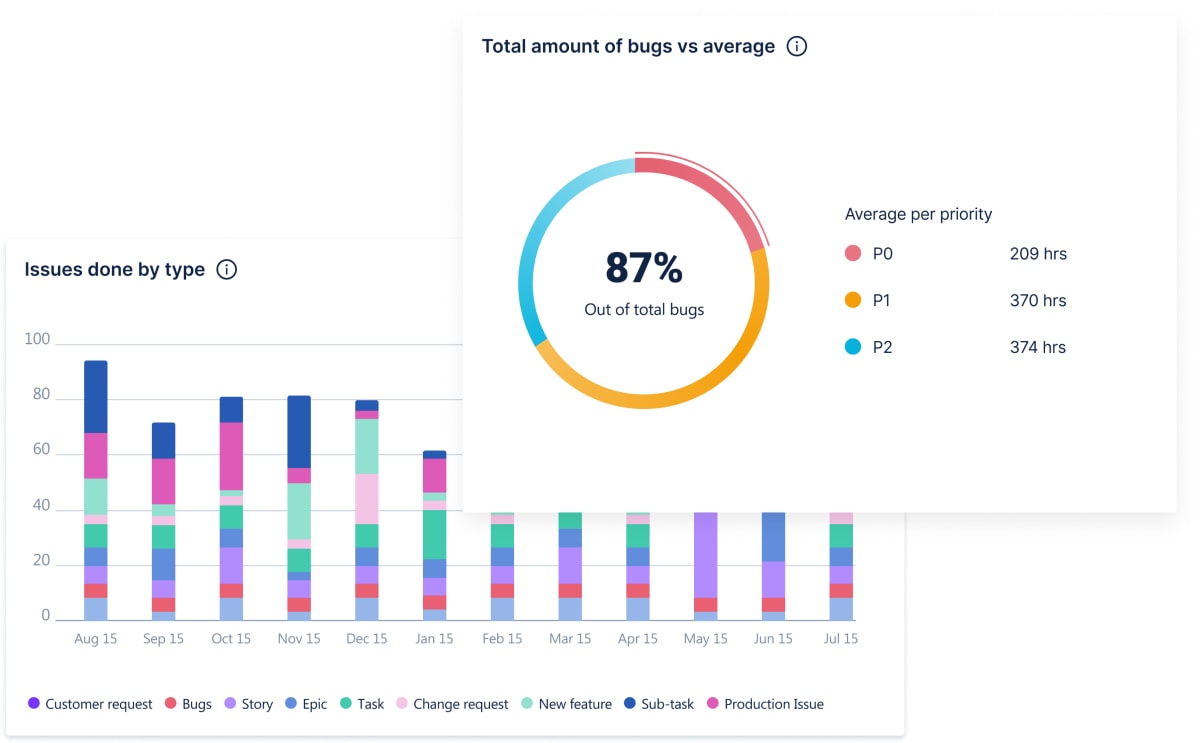
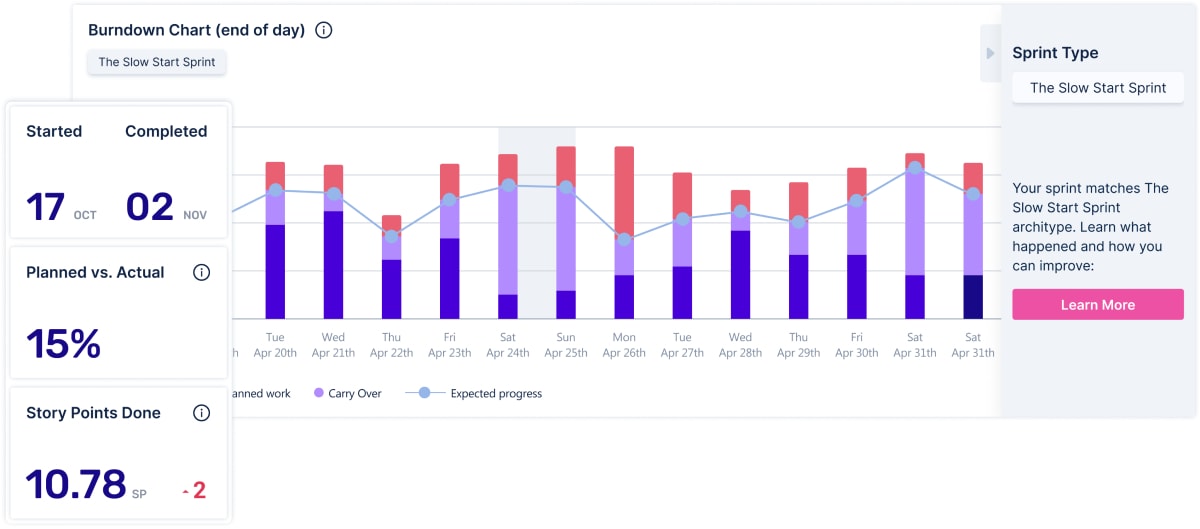
In GoRetro you get deep data integration, giving you extra details on cycle time and what it means for your team. One extension offers the ability to breakdown cycle time per status and task in the sprint. This can give you a better indication of what you spend the majority of your time on. Is it coding or review time? Maybe you need to allocate more resources for the review or refresh the priorities?
We are working on more interesting charts and data exports which will give you superpowers, allowing you to analyze your sprints to identify trends, track improvements and uncover stumbling blocks.
Say goodbye to juggling countless spreadsheets and tabs. Use your real-time sprint data to run better retros and improve your team’s performance. Get clarity of what's happening, identify gaps in planning and what your team really spends their time on.
A few final thoughts
As you can see, it’s relatively easy to get a detailed cycle time metric. You can customize this process to show lead time (how much time passes between task creation and work completion), only the time spent in intermediate status, or any other relevant status(es) you would like to measure.
Here at GoRetro, we are fascinated by cycle time. We think that breaking it down into segments will help us to better communicate our work to peers in the organization and also find bottlenecks in our development process.


